Over the years, scientists from several fields have developed a set of tools for analyzing, modelling and making predictions about complex systems using network science. Given the mathematical, computational, and statistical nature of these tools, visualizations have played a key role in network science by adding visual insight and intuition to the numerical analyses. Visualizations have also been broadly used to communicate findings, and to disseminate knowledge in the field. Broadly speaking, visualizations can help us make sense of complex phenomena by structuring data in ways that facilitate detection of patterns and trends, and ultimately, transform data into meaningful information.
The Art of Networks III presents visualizations devised in the past three years covering a broad range of topics in disciplines as diverse as cosmology, genealogy, literature, music, pedagogy, and transportation networks. Selected by a program committee, the featured visualizations were devised by leading research labs and studios around the world that are producing some of the most innovative work in this area. You can learn more about the authors and access online interactive applications by pointing your mobile device to the QR codes on each caption.
While the exhibit offers a small window into the vast world of network visualizations, we believe the projects will reveal new insights into the phenomenon under scrutiny.
information:
All day event open to the public
January 13, 2018 – March 12, 2018
Location: International Village, Northeastern University
1155–1175 Tremont St.
Boston, MA 02116
About:
The Art of Networks III was organized by Isabel Meirelles (OCAD University, Toronto, Canada), who chaired this year’s program committee comprised of Matthew Brehmer (Microsoft Research, Redmond, WA), Marian Dörk (University of Applied Sciences Potsdam, Germany), Ronaldo Menezes (Florida Institute of Technology, Melbourne, FL), and Nicole Samay (Northeastern University, Boston, MA). The exhibit is an event co-located with Complenet 2018.
The Art of Networks III would not have been possible without the financial support of the Network Science Institute at Northeastern University; the invaluable assistance of Alessandro Vespignani and Kate Coronges, the Complenet 2018 Conference Chairs; and the local coordination of Nicole Samay. Additional support was provided by the Campus Galleries at Northeastern University.
The first edition of The Art of Networks took place at the Foosaner Art Museum, Florida Institute of Technology in 2012, and the second exhibit was first presented at the New York Hall of Science in 2015, and a smaller version later traveled to the Foosaner Art Museum. All three exhibitions were co-located with Complenet.
selected projects:
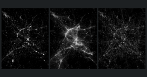
Cosmic Web
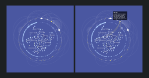
The concept of the cosmic web —viewing the universe as a set of discrete galaxies held together by gravity— is deeply ingrained in cosmology. Yet, little is known about the architecture of this network or its characteristics. Our research used data from 24,000 galaxies to construct multiple models of the cosmic web, offering complex blueprints for how galaxies fit together.
Visit the online application to immerse yourself in a network of 24,000 galaxies with more than 100,000 connections. By selecting a model, panning, zooming, and filtering, you will delve into three distinct models of the cosmic web. The interactive visualizations help us imagine the cosmic web. They show the differences between the models, and give us insight into the fundamental structure of the universe.
Visualization by Kim Albrecht. Science by Bruno C. Coutinho, Sungryong Hong, Arjun Dey, Lars Hernquist, Albert-László Barabási, Paul Torrey, and Mark Vogelsberger.
As a visual researcher and information designer, Kim Albrecht is interested in networks, power, the artificial, and how we can find visual representations for these topics to produce and represent knowledge. Kim holds a BA in graphic design from the AAA school and an MA in interface design from the University of Applied Sciences Potsdam. From 2015 to 2017 Kim worked at the Center for Complex Network Research with Prof. Barabási as a visualization researcher in Boston. His research focused on the area of finding visual representations of complex systems and particularly networks. In 2016 Kim started his Ph.D. research at the University of Potsdam in the field of media theory researching information visualizations, and their interfaces regarding their epistemological value and how they help us to make sense of the world. Since spring 2017, Kim joined the metaLAB at Harvard University to research the intersection between artificial intelligence and culture as well as finding new representations of cultural collections.
http://cosmicweb.barabasilab.com/
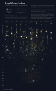
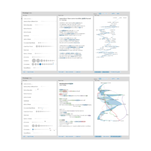
Royal Constellations: A 1,000 Years of Ancestral Connections in the European Royal Families
Royal Constellations visualizes the past and intertwined family ties of the ten current European royal leaders. It shows how interconnected the European royal families really are, who the “linking persons” are in this network, and what the shortest path is between any two persons. For example, it reveals how a royal “branch” was separated quite some time ago, such as in the case of the Prince of Monaco, and how past famous royals fit into all of this. Each “star” in the visualization is a person, placed approximately on their year of birth in the vertical direction, and to their closest relative who is a royal leader today in the horizontal direction.
In the interactive online version, you can explore the degrees of separation between royals, see how many relatives are connected to each other, and what the shortest path is between any two people in the network. For example, Pauline of Württemberg, born in 1810, is a highly connected royal that is within six generations of six current royal families.
Visualization by Nadieh Bremer, a graduated Astronomer, turned Data Scientist, turned self-taught Data Visualization Designer. After working for a consultancy and fintech company where she discovered her passion for visualizing data, Nadieh now works as a freelancing data visualization designer under the name “Visual Cinnamon.” Nadieh focuses on uniquely crafted (interactive) data visualizations that both engage and enlighten its audience. Secretly, she wouldn’t mind venturing into data and generative art as well.
http://www.datasketch.es/october/code/nadieh/
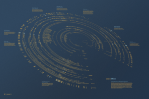
Scaled in Miles
For forty-five years Miles Davis’ vision repeatedly redefined the scope of jazz, but he didn’t do it alone. At every step of his career, he surrounded himself with wonderfully gifted musicians who were innovators in their own right. Scaled in Miles visualizes the collaborators that shaped Davis’ career in two ways: A two-sided poster and an interactive online visualization. Both representations include all of Miles’ recording sessions, from his first on April 24, 1945, to his last on August 25, 1991, and the 577 collaborating artists. The initial data was sourced from the Jazz Discography Project’s documentation of Davis’ recording sessions, with edits derived from other resources.
Scaled in Miles pays tribute to the iconic and collaborative career of Miles Davis. By exploring the information both interactively and in print, you can fully experience, interact with, and see the evolution of music from one of the greatest Jazz musicians of the twentieth century.
Visualization by Fathom Information Design, in Boston, MA. Fathom works with clients to explain complex data through interactive tools and software for mobile devices, the web, and large format installations. Founded in 2010 by Ben Fry, Fathom partners with Fortune 500s and non-profit organizations across sectors, including health care, education, financial services, media, technology, and consumer products.
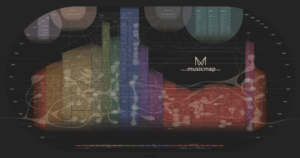
Musicmap
Musicmap attempts to provide the ultimate genealogy of all popular music genres. It bundles information regarding music genres and history in one dynamic map, serving both as an educational tool, and a framework for music databases. Musicmap features a glossary, an acknowledgment list, and a theoretical framework alongside its main tool, the interactive map. The interactive map allows various levels of detail, from exploring any genre and its influences to listening to them through embedded playlists. Musicmap is the result of more than seven years of research with over 200 listed sources, and cross examination of many other visual genealogies. The goal is to provide a delicate balance between comprehensibility, accuracy and accessibility, while offering the best possible reference for mapping and exploring music.
Kwinten was born and lives in Antwerp, Belgium, where he spends most of his time dreaming, writing down ideas, creating and drawing stuff that borders on the improbable or impossible —always while listening to music. Since young age Kwinten has regarded music as the highest form of art, capable of dealing with the strongest emotions. Besides working as an architect, Kwinten is passionate about creating and designing large and long-lasting projects. Musicmap is by far the biggest and most challenging of these projects so far. With his technically oriented brother and a number of enthusiasts, he spent almost eight years developing a satisfactory map, and interactive encyclopedia of popular music genres. He wants to go further, and transform the map into a vessel, a ship that allows you to explore the entire musical space.
On Their Way: The Journey of Foreign Fighters
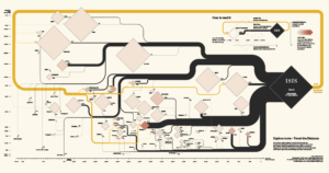
In the context of understanding the complex phenomenon of violent religious radicalization, the map details the journey of ISIS’ foreign fighters to and from the territories of the Caliphate. In addition to public available data about their journey, the map depicts the distance of each country from the destination, its total population, and Islamic population. For each country, the map indicates the outgoing flow of foreign fighters as well as the incoming flow of returnees. Countries are organized horizontally by distance from Syria, and vertically by country’s population. The size of the rhombus stands for the Muslim population of the country. Color intensity of the rhombus indicates the ratio of foreign fighters over that country’s Muslim population. The reading direction goes from left to right following the movement of foreign fighters towards the area of conflict.
The visualization was awarded Best of Show as well as Gold (World & Nations) at the 25th Malofiej International Awards (2017). It also received Gold (Current Affairs & Politics) at the 2017 Kantar Information is Beautiful Awards.
Serena Del Nero, Marco Mezzadra, Claudia Pazzaglia, Alessandro Riva, and Alessandro Zotta developed the map during the DensityDesign Final Synthesis Studio course at Politecnico di Milano. The map was then published in the Visual Data column in La Lettura, the Sunday cultural supplement of Corriere della Sera, the leading Italian newspaper.
http://alessandrozotta.it/on-their-way/
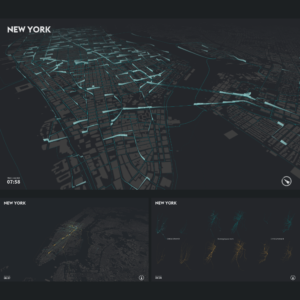
cf. city flows: A Comparative Visualization of Urban Bike Mobility
cf. city flows is a comparative visualization environment of urban bike mobility designed to help citizens casually analyze three bike-sharing systems in the context of a public exhibition space. Multiple large screens show the space of flows in bike sharing for three selected cities: New York, Berlin and London. Bike journeys are represented in three geospatial visualizations designed to be progressively more analytical, from animated trails to small-multiple glyphs.
The three images on the panel depict bike-sharing trips in New York City in the morning of June 3rd, 2015. The topmost image is a citywide view displaying aggregated data for all trajectories of bike-sharing trips for a given day, in this case June 3rd. In the interactive application, it is possible to view animated trails for trips at a given time, in this case 7:58am. On the bottom row, the left image shows the station view which depicts only the bike trips to and from a selected station (Pershing Square North), allowing the distinction between incoming and outgoing trajectories. Finally, a small-multiple view visualizes spatiotemporal patterns for three selected stations (Old Slip & Front St, Pershing Square North, E14St & Avenue B), each in an exploded view that separates incoming from outgoing, and morning from afternoon/evening trips.
Till Nagel is a professor for visual analytics at University of Applied Sciences Mannheim. Previously, he was a guest professor at Burg Giebichenstein University of Arts and Design Halle. Before that, Till was a postdoc at the FHP Urban Complexity Lab. He has a background in media and computer science, and pursued his PhD at the Human Computer Interaction group at KU Leuven. He is a research affiliate with the MIT Senseable City Lab, and the KUL Data Visualization Lab. Since 2006 he is a lecturer in creative coding and data visualization, and taught courses at several international universities. His work has been exhibited at Venice Biennale of Architecture, Shanghai Design Exhibition, IEEE VISAP, and featured in The Guardian, Süddeutsche Zeitung, The Atlantic Cities, and many more.
Christopher Pietsch is a versatile information visualization researcher. He blends art, design, and technology to create interactive experiences and spaces to explore novel types of visualization metaphors. He studied Computer Science at the HTW Berlin and Interaction Design at the University of Applied Sciences Potsdam. His bachelor’s thesis is an experimental attempt on Brain-Computer-Interfaces that discusses the multidisciplinary mysteries of human visual perception. His current research circles around aesthetic interfaces in order to enable profound new forms of data exploration. As an associate of the Urban Complexity Lab at the University of Applied Sciences Potsdam he explores novel ways to visualize cultural collections.
https://uclab.fh-potsdam.de/cf/
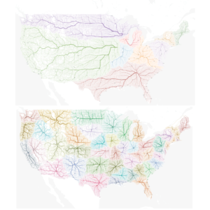
Roads to Rome
For Europe it is obvious: All roads lead to Rome! You can reach the eternal city from more than 486,713 locations across the continent. Maybe all roads lead to Rome because there is a Rome in every continent? In the United States, there are nine cities named after the Italian capital. The top map on the panel displays how every location is connected to the nearest Rome according to fastest travel time. The bottom map displays the “New United States” with state borders redefined by travel time. Every location is connected to the nearest capital city according to fastest travel time. Looking at the map it might be difficult to recognize the familiar political borders. In all three maps, the line thickness stands for the frequency a single road is used for all journeys.
The question whether all roads really lead to Rome has bothered Benedikt Groß for quite a while. With the support of Philipp Schmitt the two set out on a digital navigation quest. The results of this quest are the maps documented by Raphael Reimann that you are currently viewing. Benedikt, Philipp and Raphael are members of moovel lab, a creative working environment researching the future of transportation and many related topics.
http://roadstorome.moovellab.com/
Ross Spiral Interactive
The Ross Spiral Interactive visualization enables students and educators worldwide to explore the Ross Spiral curriculum. The curriculum is a literary narrative of the evolution of human consciousness. It is taught chronologically through the grades as a dynamic system expanding in complexity. Cultural History is at its core, interwoven with all of the other domains. While each discipline offers its own rigorous curriculum, integration between domains creates a dynamic choreography of learning. Using this interdisciplinary approach, each grade focuses on a particular historical period and theme. The Spiral provides a cohesive architecture for analysis of the past as a dynamical system and enables students to more fully understand the present while envisioning the future.
The spiral model offers a holistic view of the K–12 curriculum, allowing for exploration along multiple pathways and displaying its interdisciplinary nature. The Ross Spiral Interactive is presented with supplementary navigational and informational components, including a linear interface and a timeline, that respond in sync with the Spiral.
The Spiral Interactive was developed over a period of two years with information architect Santiago Ortiz and user interface (UI) designer Daniel Aguilar, who helped Ross to conceptualize a technical framework broad enough to cover the richness of the Ross Spiral Curriculum.
Santiago Ortiz is the head at Moebio Labs, which specializes in exploratory information visualization, knowledge maps, and visual data science, a fusion of machine learning and interaction. Santiago is a mathematician, data scientist, interactive visualization developer, and inventor, who creates and develops highly innovative and interactive projects for the web.
http://spiral.rosslearningsystem.org/spiral/
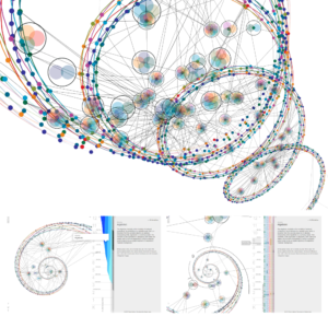
100 Data Stories
100 Data Stories is an interactive online visualization depicting the first 100 episodes of the podcast datastori.es led by Moritz Stefaner and Enrico Bertini. The podcast discusses data visualization, data analysis, and the role data plays in peoples lives with guests, who are invited to share their work with the listeners.
100 Data Stories is structured in different layers. Episodes and their participating guests are grouped according to themes in the center of the visualization. The first ring around the center presents episodes organized by time, with Episode #1 (Exuberant Animated Data Kitsch) at the top. The outer ring displays information about all guests ordered by their first appearance. To show how the distribution of gender changed over time, the guest’s gender is color coded, with yellow standing for women.
When interacting with the visualization online, you can see connections between episodes, guests, and themes. Finally, each episode is linked to the original podcast, where you can get more information, and listen to the conversation.
Christian Laesser is an freelance interaction and data visualization designer based in Berlin, Germany. He designs and develops interactive data visualizations for smaller startups, enterprises as well as institutions. Through his work, he tries to empower people by building tools and give data a form and voice. He studied interface design at the FH Potsdam, Germany and ZHdk Zurich, Switzerland.
https://projects.christianlaesser.com/100-data-stories/
Poemage
Over the last decade, there has been a flood of interest in what computation and visualization can do for the humanities. The majority of development has been in support of what is called “distant reading” —understanding literature by aggregating and analyzing massive amounts of textual data. For some humanists, however, distant reading, while interesting, is not at the core of what they do — there is another more traditional way that these scholars work, which is centered around the idea of “close reading”— the careful, in-depth analysis of a single text with the goal of extracting and engaging as much productive meaning as possible. While computation and visualization have proven highly valuable for distant reading, the true value for close reading is still very much an open question. During a two year design study we explored this question in collaboration with several poetry scholars and with a focus on investigating sound and linguistic devices in poetry. The results of this work informed the design of Poemage, a visualization tool for interactively exploring the sonic topology of a poem [1].
[1] McCurdy, Nina, et al. “Poemage: Visualizing the sonic topology of a poem.” IEEE transactions on visualization and computer graphics 22.1 (2016): 439-448.
Miriah Meyer is an associate professor in the School of Computing at the University of Utah and a faculty member in the Scientific Computing and Imaging Institute. Her research focuses on the design of visualization systems for helping researchers make sense of complex data. She obtained her bachelors degree in astronomy and astrophysics at Penn State University, and earned a PhD in computer science from the University of Utah. Prior to joining the faculty at Utah Miriah was a postdoctoral research fellow at Harvard University and a visiting scientist at the Broad Institute of MIT and Harvard. Miriah was named a University of Utah Distinguished Alumni, both a TED Fellow and a PopTech Science Fellow, and included on MIT Technology Review’s TR35 list of the top young innovators.
Nina McCurdy is a PhD student at the University of Utah’s School of Computing, where she is also a graduate research assistant at the Scientific Computing and Imaging Institute and a member of the Visualization Design Lab. Her research involves collaborating with scientists, scholars, and practitioners to design and develop visualization systems that assist in the analysis of their data, while simultaneously tackling open visualization problems. Nina’s undergraduate background is in applied physics from the University of California Santa Cruz. Nina is the recipient of a NSF Graduate Research Fellowship.
http://www.sci.utah.edu/~nmccurdy/Poemage/
Telling Stories about Dynamic Networks with Graph Comics
The research project explored graph comics as a medium to communicate changes in dynamic networks. The goal was to take advantage of the visual expressiveness and familiarity of comics to present and explain temporal changes in networks to an audience. To understand the potential of comics as a storytelling medium, the authors first created a variety of comics during a three month structured design process, involving domain experts from public education and neuroscience. This process led to the definition of eight design factors for creating graph comics and propose design solutions for each. Results from a qualitative study suggest that a general audience was quickly able understand complex temporal changes through graph comics, provided with minimal textual annotations and no training [1].
[1] Benjamin Bach, Natalie Kerracher, Kyle Hall, Sheelagh Carpendale, Jessie Kennedy, and Nathalie Henry Riche. “Telling Stories about Dynamic Networks with Graph Comics.” ACM Proceedings of the 2016 CHI Conference on Human Factors in Computing Systems (CHI ‘16): 3670-3682.
Project by: Benjamin Bach (University of Edinburgh, UK), Nathalie Kerracher (Napier University, Edinburgh, UK), Kyle Hall (University of Calgary, Canada), Jessie Kennedy (Napier University, Edinburgh, UK), Sheelagh Carpendale (University of Calgary, Canada), Nathalie Henry Riche (Microsoft Research, Redmond, WA, US).
Benjamin Bach is a Lecturer in Design Informatics and Visualization at the University of Edinburgh. He designs and investigates interactive information visualization interfaces to help people explore, communicate, and understand data. Benjamin was a postdoctoral research fellow at Harvard University, Monash University, and Microsoft-Research Inria Joint Centre. He was a visiting researcher at the University of Washington and Microsoft Research, Seattle. Benjamin received his PhD from the Université Paris Sud and Inria in 2014. In 2008/09, he was fortunate to have studied at the School of Fine Arts in the wonderful city of Lisbon.
http://graphcomics.benjbach.me